Goodreads

a visual redesign project
Goodreads is a responsive web application that allows user to track their reading, write reviews, and interact with other readers.
OVERVIEW
Problem: Goodreads features outdated visual design that detracts from the user experience
Role: UI Designer
Tools: Figma, Sketch, Adobe XD, Photoshop
Redesign
As an avid Goodreads user, I noticed aspects about the website that make it difficult and unenjoyable to use. The current site uses a very outdated UI, has complicated user flows, and lacks valuable data about users' reading habits. I focused my redesign on presenting solutions to these issues.
core features
DATA VISUALIZATION
Easy-to-understand graphs and charts with breakdowns of reading habits.
Goodreads collects copious user data but fails to provide user-friendly and insightful charts and graphs about reading habits.
I included graphs to help readers understand their reading habits, including the pace at which they read and their most commonly read genres. Readers can view the number of pages or books they've read by week, month, or year and see a breakdown of their reading by genre.

UPDATED VISUALS
Updated color palette and card design based off of current Goodreads UI
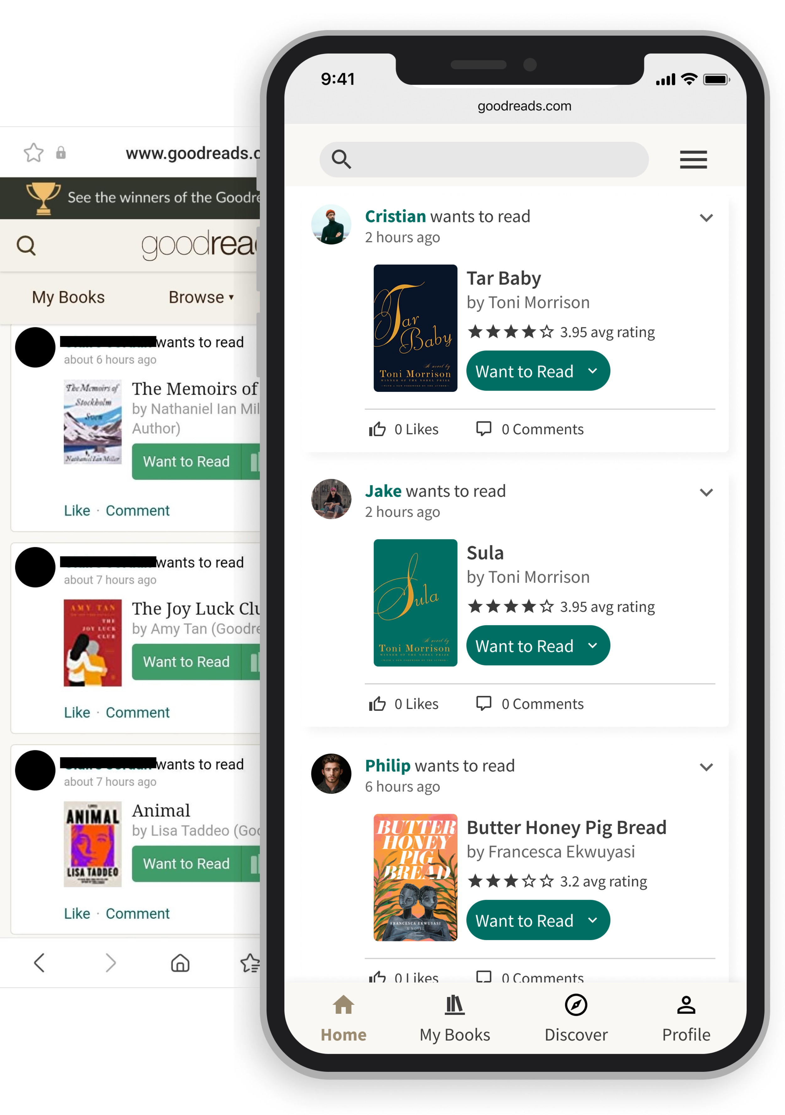
While I wanted to give Goodreads an updated feel, I didn't want to implement such drastic changes that they alienated regular users. I chose to continue to use green and yellow as my primary colors but used different shades. I focused on using cool-toned colors that evoked a feeling of calm and peace.
I also created standardized components such as card and navigation menus. I wanted to give users more control over the types of updates they say in their feed, so I added a dropdown menu to manage these settings.
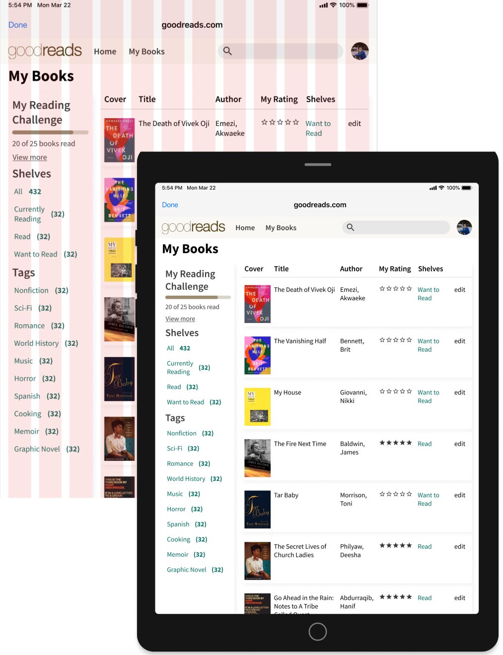
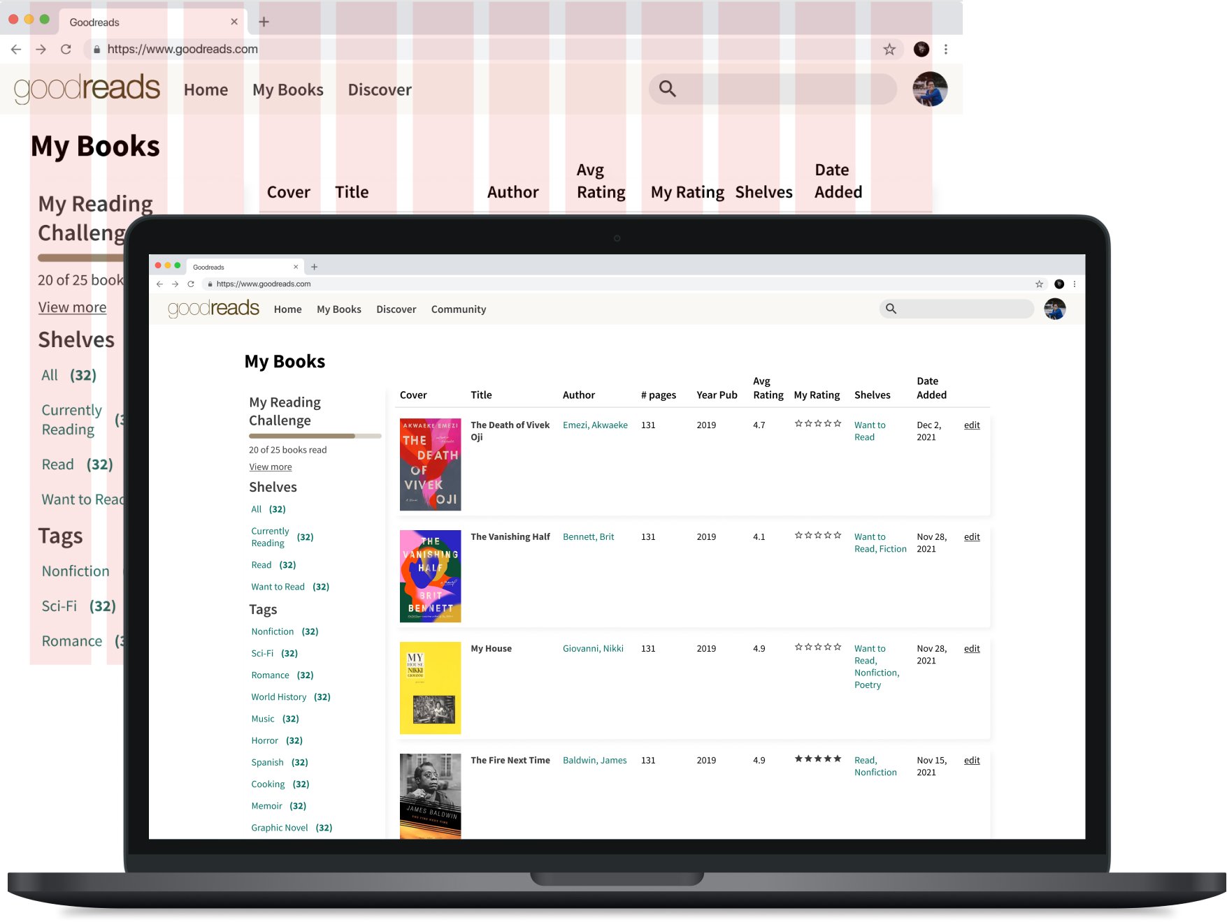
REDUCED SCROLL DEPTH
New navigation to provide readers with A preview of page content and reduce page scroll depth
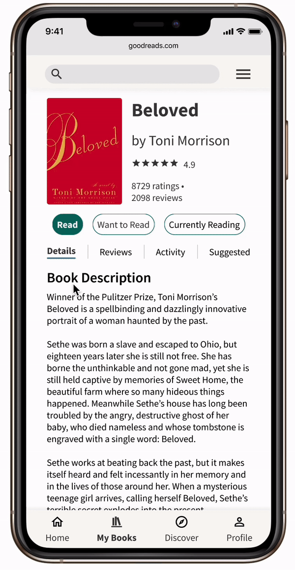
Each Goodreads book page includes copious amounts of data. In the current design, the book page has a long scroll depth, making it hard for readers to find information.
I implemented a navigation feature with tabs for each section of the book page: details, reviews, activity, & suggested. This allows readers to know what information is available at a glance and easily navigate between pages.

I used a 12 column grid system across mobile, tablet, and desktop devices to help keep page layouts consistent.
GRID SYSTEM

MOBILE:
Columns: 12
Margin: 8px
Gutter: 8px
TABLET:
Columns: 12
Margin: 16px
Gutter: 16px
DESKTOP:
Columns: 12
Margin: 32px
Gutter: 16px
COLOR

While creating an updated Goodreads color palette, I focused on using an updated version of colors that felt familiar to current users.
COMPONENT & ICON KIT

RETROSPECTIVE
WHAT WENT WELL
✅ Good learning experience for thinking about how to redesign an existing product.
✅ It allowed me to evaluate what aspects of the UI design felt outdated while planning how to modernize the look and feel of the app
NEEDS IMPROVEMENT
❗️ I'd like to have time to conduct interviews with regular Goodreads users to learn their thoughts on the product.
❗️ I think that I got too comfortable following the existing layout and could have done a better job of going out of my comfort zone and proposing an entirely new look.
NEXT PROJECT