Defensores
de la cuenca

Full UX Site Audit and Redesign
I conducted a full UX audit and bilingual website redesign for a Maryland-based organization focused on connecting Latinos and Spanish-speakers to nature through opportunities to preserve the Chesapeake Bay watershed.
OVERVIEW
Background: Defensores de La Cuenca (DDLC) is a Latino-serving organization based around the Chesapeake Bay Watershed that aims to connect Latines and Spanish-speakers to nature, while uplifting and mentoring local leaders.
Problem: A disorganized and inconsistent website made it difficult for participants to find program information and for funders to learn more about the organization.
Tools: Figma, Miro, Wix
UNDERSTANDING THE PROBLEM
AUDIT & SITE MAP
To fully understand the issues with the current site and potential solutions, I started this project by conducting a full site audit of both Spanish and English versions of the site. I reviewed the mobile and desktop sites and visualized the current site map.
ORIGINAL SITE MAP

KEY FINDINGS
1
2
3
No clear site hierarchy, making the website difficult to navigate
Difficult to find the organization's mission, purpose, or impact
The English and Spanish versions of the site have different information and are hard to navigate between.
HOW MIGHT WE…
1
2
3
Rearrange site pages to establish clearer structure and make information easier to find?
Present organizational information in a way that is easy to locate and communicates impact?
Create more consistency across the website and ensure that both English and Spanish speakers receive the same information?
WHO ARE THE USERS?

ORGANIZATIONAL FUNDER
Interested in learning quick facts about the organization's work and impact

SPANISH-SPEAKING COMMUNITY MEMBER
Needs an easy and reliable way to learn about organization's upcoming activities and how get involved

GENERAL INTEREST MEMBER
Wants to know more about the organization's purpose and programming
IDEATE
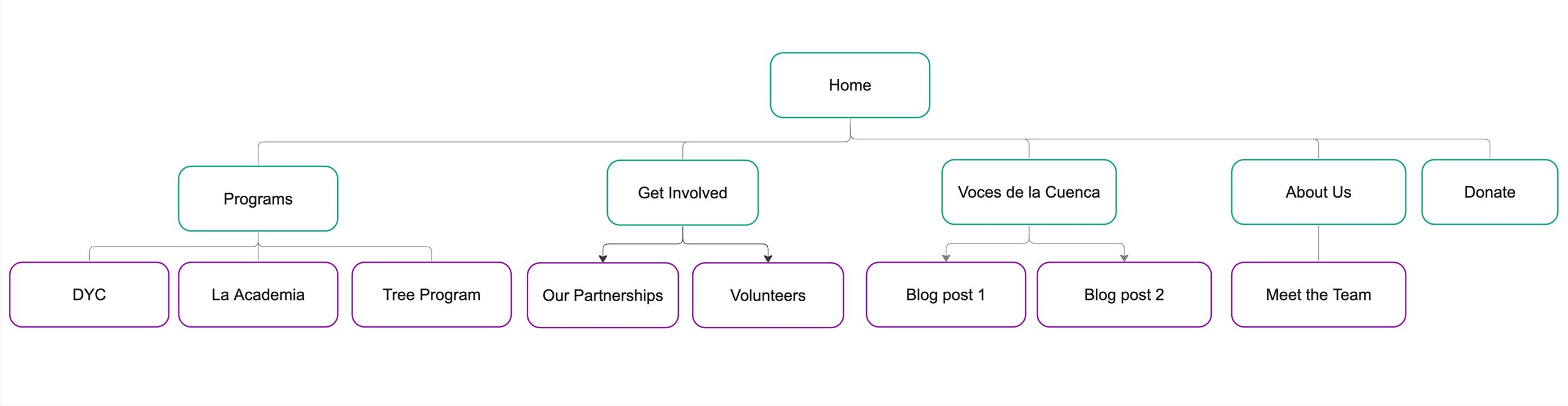
NEW SITE MAP
Based on the established “how might we?” questions, I rearranged the site with the 3 target users in mind. This site map would make it easier to learn:
about the organization’s impact
which programs are offered
how to get involved
WIREFRAMES
My initial wireframes focused on bringing programming and organizational impact information to the forefront.


MID-FIDELITY PROTOTYPE
After receiving feedback about my wireframes from the Defensores team, I began designing a mid-fidelity prototype.


DESIGN
ORIGINAL SITE DESIGN
One longstanding issue with the website was the inconsistent and incomplete branding and typography. Pages were often a variety of dark colors and font styles varied page by page.


BRANDING

I standardized the organization's design by creating a color palette based on their existing logo and establishing a consistent typography.
HI FI PROTOTYPES


LAUNCH
Taking the information I gathered from my research, feedback from the team, and newly established branding, I transformed my hi-fidelity prototype into a live site using Wix, the organization's preferred website service. The site is now managed by the organization.


RETROSPECTIVE
WHAT WENT WELL
✅ Identifying primary audiences and creating solutions to meet each of their needs
✅ Standardizing design across the website helped create a more cohesive feeling
NEXT TIME
I'd like to have more time and resources to work directly with community members for added feedback and suggestions.
NEXT PROJECT